As web developers we’ve used countless UI libraries that give us an interface for creating grids. Now things have become much easier thanks to Grid and Flexbox in CSS, but it is still nice to have everything arranged in nice consistent classes for production use. Recently, I set out on a mini-mission to find a grid library for our new design system. In my search, I had to go through many libraries, their features and their source code. Most of them were 90% fit for my use case, but then I’d find some flaw that’d put me off. This continued for a couple of hours, at the end of which I uttered the golden developer words “I know, I’ll just implement my own grid library”. The old folks here know what follows. They also know, irrespective of whether you know if this is a bad idea, the temptation to start working in an empty file without any dependencies is too real to just ignore.
Anyway, after spending some time baking my own grid library, and slowly realizing that in probably a week or so, I’ll end up with exactly the kind of code that I’d rejected earlier, given how similar everything was looking, I decided to go with something readybaked. But this little exercise of trying to make a grid library taught me a lot about how these libraries are implemented. I wish to share some of that excitement, the learnings with you in this article.
By the end of this article, I want you to have at least a basic understanding of how a grid library is written and be confident to dig into the source code in case you need to customize a library to fit your needs. Note that I’m using Flexbox. Bootstrap 3 used widths and floats, and Bootstrap 4 uses Flexbox. I believe you can also use CSS3 Grids. Use what feels natural to you.
What’s a grid system?
A grid means what you’d expect it to mean. It is a two dimensional cellular structure, like a cupboard or a chess board, and you can put/place stuff on/in it. In the context of web development and design, grids usually just define the vertical or columnar properties. The reason is that we do not want to design for horizontal scrolling, and assume that all navigation on a page will be based on vertical scrolling. As a result, whatever the screen width is, we take that as 100% and divide it into the number of columns that we prefer.
First step is to set the number of columns that we’d like the designs to use. 12 is commonly used because with 12, we can divide the page into 1, 2, 3, 4, 6 and 12 parts (notice that those are just divisors of 12). Then we set the gutter size. Gutter is the gap between two columns. Usually we set it to 1rem which, if we haven’t modified, should be 16px.
After that, we set breakpoints. Breakpoints are points where our UI changes in response to a change in the screen size. For modern websites, we have to cater to a wide variety of browsers and screen sizes, and defining a set of screen sizes is our first step towards it. For example
- 0-450px can be considered to be small mobiles
- 450px-750px can be large mobiles
- 750px-1000px can be tables
- 1000px+ can be desktops
This is all very arbitrary, of course. we can set whatever sizes fit most of our users’ device types or just copy what Bootstrap or other popular libraries do (in general, when in doubt follow the standards).
Next is to actually implement designs that adhere to this grid system. Here we make an assumption that we have a UI hi-fi design mockup that was built using the same 12 column grid as base. For ease of implementation, we can define the CSS classes that we frequently use, which while not absolutely necessary, is helpful.
Basic CSS
While I mentioned that it isn’t absolutely necessary to have CSS classes that help us with grids, more often than not we’ll want to have some of them. The way we do it is we write classes for all the possible widths that a div might take on the screen, right from 1/12 to 12/12 (which is essentially 100% width).
.row {
  display: flex
}
.col-1 {
  flex-basis: 8.3333333% // (1/12)*100
}
.col-2 {
  flex-basis: 16.666666% // (2/12)*100
}
// and so on
In this short snippet, a .row would be the wrapper class for one or more .col-X classes.
Styling our HTML
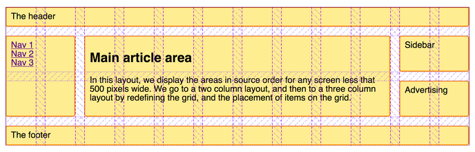
Consider the simple markup. This is a typical layout for a blog with a navigation section on the left, blog content in the center and a sidebar on the right with some widget.
<main class="row">
  <aside   id="navigation"></aside>
  <article id="content"></article>
  <aside   id="blog-roll"></aside>
</main>
Now, if we want to split the page into three columns; left sidebar (25% or col-3 containing the “.navigation”), main content (50% or col-6 containing “.content”) and right sidebar (25% or col-3 containing “.blog-roll”), we just have need to add the relevant classes to our markup
<main class="row">
  <aside    id="navigation" class="col-3"></aside>
  <article  id="content"    class="col-6"></article>
  <aside    id="blog-roll"  class="col-3"></aside>
</main>
It should give you a grid like the following.
Gutters
If you ignore the basic styling and borders, you’ll notice that there’s still no spacing between the columns (or gutters) here. We need spacing because otherwise we’ll have to add internal padding to all the columns and we do not want content from one column sticking to the content from another. To have some of that, we define a gutter variable and add half gutter width padding on right and left side of our columns.
:root {
  --gutter-half-width: .5rem
}
.row {
  & > *[class^="col-"] {
    padding-left: var(--gutter-half-width
    padding-right: var(--gutter-half-width
  }
}
Note that --gutter-half-width is just a variable in CSS that we access with the var() function. & > *[class^="col-"] selects all direct descendants of row class which have the col-* class set. :root selects the document root.
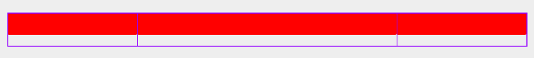
We don’t want gutters on the extreme left and extreme right of our grid. We compensate for that with negative margins on the .row class.
.row {
  margin-left: calc(var(--gutter-half-width) * -1
  margin-right: calc(var(--gutter-half-width) * -1
}
If you were to re-run the CSS again, we’d have something like the following.

Mobile responsiveness
At this point, our grid system is ready. Ready for one screen size, that is. Let’s see what happens if we switch to mobile view?

I mean, it kind of does what we asked it to do, but if those columns were in fact two sidebars and one main content section, and this being displayed on a 320px screen, your users would be pretty irate (or worse, your website becomes popular on r/CrappyDesign). You don’t want that, don’t you?
To fix that, we’ll use the breakpoints that we had discussed about earlier. Essentially, we want to have three columns on desktops (which we’ve already made), one on tablet and one on mobile phones in a row. We start off with writing the media queries for each of our breakpoint.
@media only screen and (max-width: 449px) {
  // classes for mobile view
}
@media only screen and (min-width: 450px) {
  // classes for tablet view
}
@media only screen and (min-width: 768px) {
  // classes for desktop view
}
Next, we write the column CSS classes for each media query (same code, but we’ll rename them a bit so that we can tell which class is for which viewport). Notice the col-[viewport-name]-[column-width] format. You’ll might recognize this from libraries like Bootstrap (for example, col-md-3 or col-xs-6).
@media only screen and (max-width: 449px) {
  .col-mobile-1 {
    flex-basis: 8.3333333%
  }
  .col-mobile-2 {
    flex-basis: 16.666666%
  }
  // col-mobile-3 to col-mobile-10
  .col-mobile-11 {
    flex-basis: 91.666666%
  }
  .col-mobile-12 {
    flex-basis: 100%
  }
}
@media only screen and (min-width: 450px) {
  .col-tablet-1 {
    flex-basis: 8.3333333%
  }
  .col-tablet-2 {
    flex-basis: 16.666666%
  }
  // col-tablet-3 to col-tablet-12
}
@media only screen and (min-width: 768px) {
  .col-desktop-1 {
    flex-basis: 8.3333333%
  }
  .col-desktop-2 {
    flex-basis: 16.666666%
  }
  // col-desktop-3 to col-desktop-12
}
Now, we can edit our HTML to use these new classes. For each viewport, we add a class which tells the browser how wide it needs to be on that viewport. For example, our article section is 50% in width (or 6 out of 12 columns) on desktop, while 100% on tablet and mobile (or 12 out of 12 columns).
<main class="row">
  <aside   class="col-desktop-3
                  col-tablet-12
                  col-mobile-12" id="navigation"></aside>
  <article class="col-desktop-6
                  col-tablet-12
                  col-mobile-12" id="content"></article>
  <aside   class="col-desktop-3
                  col-tablet-12
                  col-mobile-12" id="blog-roll"></aside>
</main>
This will ensure our columns are 100% width on tablet and mobile screens. And because our classes are inside of media queries that only fire at the viewport width breakpoints, only the relevant class gets applied. As you can imagine, one can really fine tune how things look by selecting a higher number of breakpoints and designing for a more consistent UI across the spectrum of screen sizes.
Bonus – Hiding sections
Let’s say we decide that the blog-roll section isn’t super important on mobile screens, and should be removed. This is a common usecase; hiding specific blocks on specific viewports. And there’s a very easy way of doing this right in the grid system.
The little trick is to add hidden classes, just like our column classes, to our viewport media queries.
@media only screen and (max-width: 449px) {
  .col-mobile-hidden {
    display: none
  }
}
@media only screen and (min-width: 450px) {
  .col-tablet-hidden {
    display: none
  }
}
@media only screen and (min-width: 768px) {
  .col-desktop-hidden {
    display: none
  }
}
Now, to hide the blog-roll on mobile phones, we just add the hidden class to its classlist.
<main class="row">
  <aside class="col-desktop-3
                col-tablet-12
                col-mobile-hidden" id="blog-roll"></aside>
</main>
Code
I’ve posted truncated snippets above. The whole thing would look something like the following.
:root {
  --gutter-half-width: .5rem
}
.row {
  & > *[class^="col-"] {
    padding-left: var(--gutter-half-width
    padding-right: var(--gutter-half-width
  }
  margin-left: calc(var(--gutter-half-width) * -1
  margin-right: calc(var(--gutter-half-width) * -1
}
@media only screen and (max-width: 449px) {
  .col-mobile-1 {
    flex-basis: 8.3333333%
  }
  // ...
  .col-mobile-12 {
    flex-basis: 100%
  }
  .col-mobile-hidden {
    display: none
  }
}
@media only screen and (min-width: 450px) {
  .col-tablet-1 {
    flex-basis: 8.3333333%
  }
  // ...
  .col-tablet-12 {
    flex-basis: 100%
  }
  .col-tablet-hidden {
    display: none
  }
}
@media only screen and (min-width: 450px) {
  .col-desktop-1 {
    flex-basis: 8.3333333%
  }
  // ...
  .col-desktop-12 {
    flex-basis: 100%
  }
  .col-desktop-hidden {
    display: none
  }
}
Possible extensions
The flexbox standard defines various ways of arranging things inside the container both along the flex-direction axis (called the main axis) and the cross axis (the axis perpendicular to the main axis). If we were to extend this, we could define helper classes like .col-reverse (flex-direction: reverse) or .col-spread-out (justify-content: space-between) using these properties depending on our use cases.
In closing
The flexbox standard is pretty elaborate, and extremely well documented. There are also good libraries build around Flexbox that provide what we just build, and much more than that, out of the box. In production, one should try to stick to libraries and not reinvent the wheel.
Having said that, it is also important to understand the libraries that we use. Now we know what actually happens when we use that familiar col-md-6 class from Bootstrap, and if need be, we won’t shy away from editing the source code to make the library fit our needs!
Thank you for reading!